University Visual Identity: Logos
Primary Logo
The university logo reflects the primary identity of the institution. Research shows that the use of multiple, differing logos dilutes the impact of our brand. Consistency and unity in logo usage strengthens our brand presence.

The primary logo consists of a shield on the left-hand side, with fields and a rising sun. This imagery represents the growth of the university and the fertile lands of our southern San Joaquin Valley. The primary logo includes the full name of the university to identify it as one of the 23 campuses in the California State University (CSU) system. It strategically uses the words "California" and "University" to attract larger audiences who may not know the university acronyms.
Logo Usage
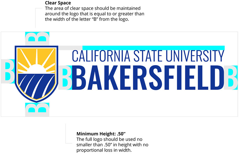
The full logo should be used no smaller than 0.50" in height with no proportional loss in width. Ensure there is clear space around the logo that is equal or greater than the letter "B" in the logo.
Color Variations
The university's official colors are blue and gold. However, the logo may be produced in one or two colors. Examples are shown below.

Stacked Logo
To allow for additional flexibility, the logo may be utilized in a stacked form.

Basic Rules
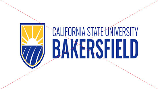
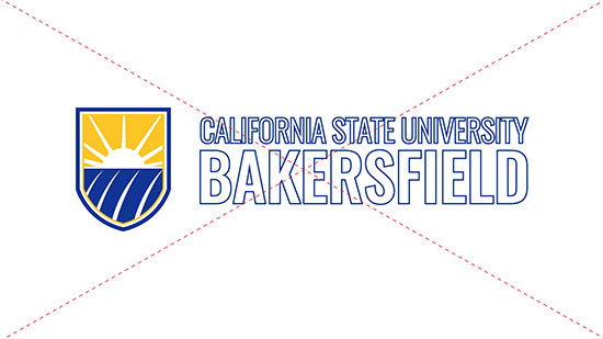
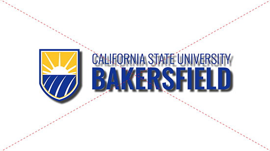
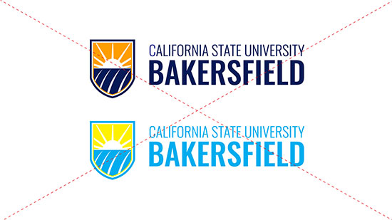
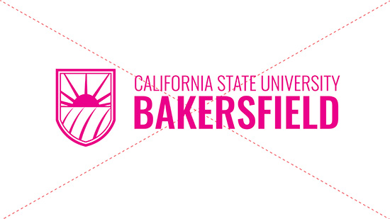
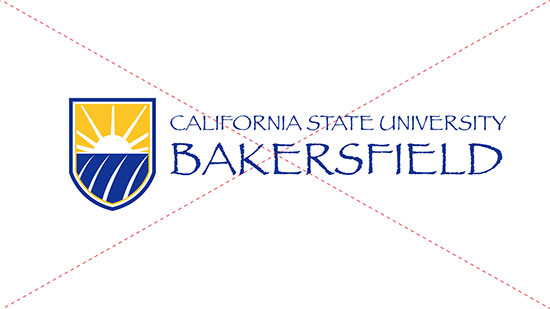
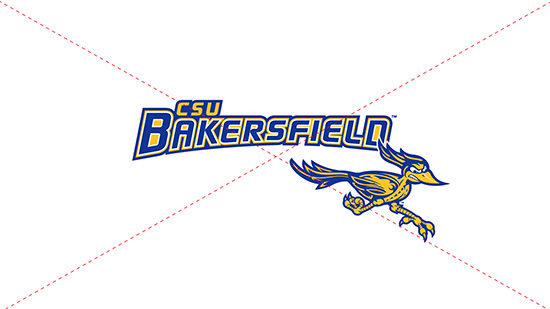
The university logo should not be altered in any way. Here are a few basic rules to keep in mind.



College, Department or Unit Logos
There are four variations of the university logo that can be used for colleges, departments, programs, centers, institutes or other units on campus. This allows campus units to maintain their unique identity while still portraying a unified brand presence. Please do not create this logo yourself.
Email brand@csub.edu to obtain your school, department or unit logo.

Version #2: Horizontal Unit Logo

Version #3: Prominent Unit Name Logo

Version #4: Stacked Unit Logo

CSUB Mark
There are rare cases where the full, primary logo is not ideal, such as in small spaces or on select merchandise. In those scenarios, the following CSUB mark may be used.
